Normal technology, ergo incremental change

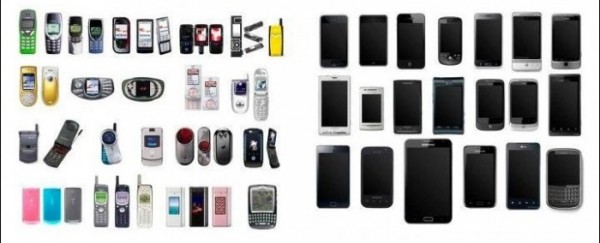
Thomas Kuhn portrayed scientific research as long periods of “puzzle-solving” based on an accepted paradigm, with occasional bouts of revolutionary upheaval during which one paradigm is replaced by another. (See my extended essay on Kuhn, celebrating the 50th anniversary of his great book.) Much the same goes on in technology, IMHO. At the moment, we’re in a phase of “normal” technology with everything based around the paradigm of a smartphone laid down by Apple with the iPhone. This graphic (from CultOfMac) makes the point well.

This NYTimes piece starts to make the same point, but then gets a bit lost. Still, good in parts.

The iPhone 5 that Apple introduced last week with only incremental changes seemed to signal that the industry has entered an era of technological bunny hops.

Faster chips, bigger screens and speedier wireless Internet connections are among the refinements smartphone users can count on year after year in new models, most of them in familiar rectangular packages. They are improvements, to be sure, but they lack the breathtaking impact the first iPhone had, with its pioneering fusion of software and touch screens.

“Since then, it has been kind of incremental,” said Chetan Sharma, an independent mobile analyst. “It does not feel like there is a big shift.”

Yep. See also this Observer column about how we’re stuck in an app-centric rut for the time being.

Our new software monoculture

This morning’s Observer column.

Apple has to date authorised 500,000 [Apps] for its iPhone. The corresponding number for the Android platform is 600,000. These numbers provide ample justification for the late Steve Jobs’s great insight: phones were really powerful hand-held computers that could run useful applications. And so it proved. Jobs unleashed an explosion in creativity as programmers raced to create apps that people would buy in huge volumes. The result is a world in which smartphones are basically app-running devices that can also make voice calls. Ditto for tablets, except that they don’t bother with the calls.

So that’s all right, then? Not quite. Look closer at this explosion of creativity and you find that much of what it has created is either trivial or downright crap. You can, for example, get an app to put an image of bubblewrap on your iPhone screen. Then there’s the Halloween Sound Machine (“Sneak up on your mates with the sounds of a rusty chainsaw, go on, you know you want to!”). Or how about iBeer (“turns the iPhone’s screen into a showy pint of the foamy stuff”)? And gentlemen trying to decide between a walrus moustache, Victorian sidewhiskers or a goatee beard will doubtless find Beard Booth invaluable.

I could go on, but you get the point. A large proportion of smartphone apps are the contemporary equivalent of those plastic gee-gaws my kids bought all those years ago: impulse purchases that provide a moment’s entertainment – or even delight – and are then forgotten…

Smartphones, clouds and control

This morning’s Observer column about the latest Ofcom survey of the communications market.

The Ofcom document runs to 411 pages, so it is custom-built for empirical masochists. Given that life is short, and you may have other things to do on a Sunday morning, I will just focus on some findings in the report that leapt out at me, and ponder their implications. The survey shows that home internet access in the UK rose by 3% between 2011 and 2012 and now stands at 80%. So eight out of 10 people have access to the network. And the speed of that access is increasing: by the first quarter of 2012, for example, 76% of UK homes had a broadband connection of some description. Equally interesting is the discovery that the largest rise in internet access over the last year – 9% – was among 65 to 74-year-olds. So the idea of “silver surfers” as an endangered minority needs recalibrating.

Next, we find that two-fifths of UK adults are now smartphone users. Take-up has risen from 27% in 2011 to 39%. This is interesting because the mobile networks and the telecoms industry have in the past consistently underestimated the popularity of internet-enabled mobile phones. It’s also one of the reasons why Nokia finds itself in so much trouble.

It’s hard to exaggerate the significance of the smartphone tsunami, especially when we see Ofcom’s discovery that more than four in 10 smartphone users say their phone is more important for accessing the internet than any other device…

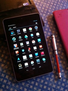
Google Nexus 7: first impressions

My Nexus 7 arrived yesterday. Here are first impressions:

Upsides

  • Yay! It does fit in a jacket pocket. In fact it’s easy to carry about unobtrusively.
  • Battery life: no rigorous test, but seems reasonable. At any rate it’s largely untouched (67% remaining) after a day’s text and browsing work (no multimedia). The Settings panel is very informative about battery use, showing which Apps are using most power.
  • Settings are easy and intuitive.
  • On-screen keyboard: Nice but seems erratically unresponsive at times. (Or else I haven’t figured out how to drive it.) Better layout than the default layout on iPad keyboard. Big plus: because of the physical size of the device and the portrait orientation I can type with two thumbs, like I used to do with my Psion 3 in the dim and distant past.
  • I tried it with Apple Bluetooth keyboard. Pairing was a bit fiddly. But once done, it worked just fine.
  • Nice screen.
  • Lighter than iPad. Easier to use as e-reader.
  • Great autocorrect when typing in Write app.
  • Very simple setup. Google ecosystem works well. Well, it ought to: if they can’t get that right, then they ought to quit.
  • Immediate auto-upgrade to Jelly Bean (where do they get these idiotic names?) You can also set Apps to auto-upgrade. Wonder if that’s also true of the OS. One of the bugbears with Android that drove me into the arms of IoS was the problem of upgrading from one Android version to another.)
  • Neat packaging and small charger.
  • Downsides

  • Portrait only – except for YouTube. I naively thought that this was controlled by software. But it seems to be baked in. This is very restrictive, especially for web pages. Unacceptably small print is the only way it can get everything in. I was completely wrong about this. Jeff Jarvis kindly explained (on Twitter) that there is a tiny icon in the Notifications panel which enables screen rotation to be toggled on or off. But there’s a cunning kicker: the home screen doesn’t auto-rotate; it’s only when one is running an app that rotation works.
  • Front-facing camera. Hopeless for photography. Not particularly impressive but adequate for Skype.
  • Twitter app not as good as the iPad version.
  • Only WiFi. No 3G. (Worked fine with iPhone as modem, though.)
  • Mixed

  • Apps ecosystem seems more chaotic than the IoS one. (This may be a reflection of my unfamiliarity with Android, not having used an Android device for 18 months.) Some apps, however, seem pretty good. Kindle for example. Ditto a note/journal writing tool called Write. Ditto Evernote. Nice integration between apps — eg between Write and Evernote. WordPress blogging app seems better than the IoS one. (Memo to self: check for upgrade on IoS).
  • Overall

    Pretty good. Half the price of an iPad. Reasonable performance, good screen and some really good apps. And it fits nicely into your pocket.

    Can’t figure out what the business model or marketing rationale is, though. I don’t think it’s really aimed at the iPad. So is it aimed at the Kindle Fire? (Since I haven’t tried the Fire I don’t have any basis for a comparison.) Most of the existing reviews seem to say: nice kit, pity about the content. But I’m not interest in ‘consuming content’: I want a device that I can use for the work that I do, which mainly involves thinking about, generating and editing ‘content’ (note-taking, newspaper columns, lecture drafts, outlines, photographs). At the moment, the iPad software ecosystem is proving brilliant for all of these uses — but it took time for the necessary apps to appear. The Nexus 7 is nowhere near as good for these purposes at the moment. But perhaps the necessary software will eventually arrive.

    Other reviews

    Charles Arthur — Guardian

    Wired.co.uk

    Tech Review

    PC Advisor

    Daily Telegraph

    Arstechnica

    The Apps fallacy

    It’s funny to watch the current obsession with Apps. It reminds me of Aldous Huxley’s idea that we would be destroyed by things that delight us. In the news arena, Apps are the route by which the old dinosaurs of the mass media world hope to re-establish control. It won’t work, but it’ll take a while before people realise why. They could save a lot of time by reading Dave Winer.

    I’ll keep playing here while the rest of you flirt with apps. I’ll be here when you come back. I know it’s going to happen. Here’s why.

    Linking.

    Visualize each of the apps they want you to use on your iPad or iPhone as a silo. A tall vertical building. It might feel very large on the inside, but nothing goes in or out that isn’t well-controlled by the people who created the app. That sucks!

    The great thing about the web is linking. I don’t care how ugly it looks and how pretty your app is, if I can’t link in and out of your world, it’s not even close to a replacement for the web. It would be as silly as saying that you don’t need oceans because you have a bathtub. How nice your bathtub is. Try building a continent around it if you want to get my point.

    We pay some people to be Big Thinkers for us, but mostly they just say things that please people with money. It pleases the money folk to think that the wild and crazy and unregulated world of the web is no longer threatening them. That users are happy to live in a highly regulated, Disneyfied app space, without all that messy freedom.

    I’ll stay with the web.

    Me too.

    Steven Johnson’s Hearst Lecture is a more extended riff on the same theme. Well worth reading in full. Which of course rather makes Dave’s point: you can click on the link and go straight to the lecture. Which you can’t do in most apps. The medium is the message: no linking; stay inside the glass box.

    15,000 new Apps a week!

    Fascinating piece in the New York Times

    .

    The pace of new app development dwarfs the release of other kinds of media. “Every week about 100 movies get released worldwide, along with about 250 books,” said Anindya Datta, the founder and chairman of Mobilewalla, which helps users navigate the mobile app market. “That compares to the release of around 15,000 apps per week.”

    According to Mobilewalla, in a fairly quiet 14 days before the release of app No. 1,000,000, an average of 543 apps were released each day for Android-based devices, and an average of 745 apps hit the market daily for the iPhone, iPad and iTouch. The total for the two weeks across the Apple, Android, BlackBerry and Windows platforms was 20,738.

    A product was counted each time it was designed for a different device in the climb to a million apps. So when Urbanspoon was released for iPhone, BlackBerry, iPad and Android, it was counted four times because each platform demands different code from the developers.

    By any measure, the rise in apps is striking. In October 2008 the known app universe was 8,000 Apple titles. Mobilewalla was formed that year to provide a Web site for users to search for mobile apps, and to categorize and rank them.

    Mobilewalla began analyzing Android and Windows apps in 2009, and added BlackBerry a year later. The 100,000-app milestone was passed in December 2009. In little more than a year, the total passed 500,000 and exceeded 750,000 six months after that. Five months later: one million.

    Wired: not all fired up by Amazon Fire

    Useful review in Wired of the upcoming Amazon Fire tablet. The verdict: don’t hold your breath.

    If you already have $200 in your high-tech hardware slush fund, and you’re not willing to splurge one cent more, I suggest you wait longer before pulling the trigger on a tablet. Let that nest egg build. Let it grow interest. Wait for the Kindle Fire 2.

    Or — yes, I’m going to go there — consider an iPad.

    By the time iPad 3 comes out, Apple’s cheapest iPad 2 will almost certainly be even cheaper. And this could very well be the tablet for you: 9.7 inches of uncompromised screen real estate, a processor that rips through web pages like a chainsaw, and an app and digital content ecosystem that’s already commensurate to (if not better than; let’s be serious) anything Amazon offers.

    iPad killer? No, the Kindle Fire is not. And it doesn’t even match the iPad in web browsing, the one area in which its hardware should have sufficient performance to compete. But the press has definitely supercharged Amazon’s product launch with a level of hype and enthusiasm that would make Apple proud.

    WIRED A great platform for casual video playback. A perfectly fine Android 2.3 app device. A price that pleads “buy me,” repeatedly, until you crack a big grin, and give in like a good-natured father buying trinkets for the kids at Wal-Mart.

    TIRED Small screen size and insufficient processing power. Crap browser performance. Near useless as a magazine reader, and roundly trumped by superb e-ink Kindles as a book reader.

    Why the Web might be a transient

    As I observed the other day, one of the things that drove me to write From Gutenberg to Zuckerberg was exasperation at the number of people who thought the Web is the Internet. In lecturing about this I developed a provocative trope in which I said that, although the Web is huge, in 50 years time we may see it as just a blip in the evolution of the Net. This generally produced an incredulous reaction.

    So it’s interesting to see Joe Hewitt arguing along parallel lines. Unlike me, he suggests a process by which the Web might be sidelined. “The arrogance of Web evangelists is staggering”, he writes.

    They take for granted that the Web will always be popular regardless of whether it is technologically competitive with other platforms. They place ideology above relevance. Haven’t they noticed that the world of software is ablaze with new ideas and a growing number of those ideas are flat out impossible to build on the Web? I can easily see a world in which Web usage falls to insignificant levels compared to Android, iOS, and Windows, and becomes a footnote in history. That thing we used to use in the early days of the Internet.

    My prediction is that, unless the leadership vacuum is filled, the Web is going to retreat back to its origins as a network of hyperlinked documents. The Web will be just another app that you use when you want to find some information, like Wikipedia, but it will no longer be your primary window. The Web will no longer be the place for social networks, games, forums, photo sharing, music players, video players, word processors, calendaring, or anything interactive. Newspapers and blogs will be replaced by Facebook and Twitter and you will access them only through native apps. HTTP will live on as the data backbone used by native applications, but it will no longer serve those applications through HTML. Freedom of information may be restricted to whatever our information overlords see fit to feature on their App Market Stores.

    I hope he’s wrong and given that he’s a serious and successful Apps developer he has an axe to grind. But his blog makes one think…

    FT’s HTML5 app more popular than app sold in Apple store

    Well, well. Isn’t this interesting.

    (Reuters) – More than 700,000 people use the Financial Times’ Web-based mobile application to access news and other content, making it more popular than the version sold in Apple’s App Store.

    The business newspaper, which is part of British publishing group Pearson Plc, made a gamble in June when it prepared to ditch the App Store with the introduction of its Web-based app.

    The FT was one of the first major publishers to reduce its dependence on Apple Inc and go out with an HTML5-based mobile application that can be read by any browser, thus bypassing the App Store.

    FT.com Managing Director Rob Grimshaw told Reuters that the new Web-based app was drawing more traffic than the version that was sold through the App Store.

    “People who are using the app are spending much more time with the content,” he said. “They are consuming about three times as many pages through the app as they are through the desktop in an average visit.”