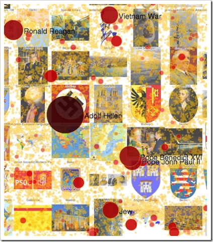
This is a graphical visualisation of the 20 most hotly-revised articles in Wikipedia. The diagram comes from a fascinating article on how it was constructed. In essence, the authors used network theory:
We began this piece by representing the data as a network. In this case the nodes in the network are wikipedia articles and the edges are the links between articles. We then (with some help from our friends at Sandia) used an algorithm to lay out all 650,000 nodes (wikipedia articles) that had at least one link in such a way that similar articles are near one another. These are the yellow dots, which when viewed at low res give a yellow tint to the whole picture.
The sizes of the nodes (circles, dots, whatever you want to call them), are based on a model of revision activity. So large circles indicate that an article might be controversial, or the subject of lots of vandalism, or just a topic whose content frequently changes. We labeled only the largest nodes, to keep it readable. There is an interactive version of this in the works based on the google maps platform which will change the labels and pictures used as the user ‘zooms’ in or out. Stay tuned for that.
The image used for each tile was selected automatically, simply by using the first image in the most linked to article among all the articles in that tile. We were pleasantly surprised by the quality of the images that appeared.
Our hope for this visualization approach, which we continue to improve on, is that it could be updated in real time to give a macro sense of what is happening in Wikipedia. I personally hope that some variation of it will end up in high schools as a teaching tool and for generating discussions…
