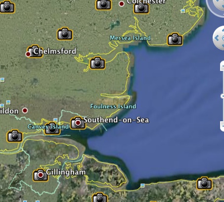
This must be one of the most innovative things ever to appear on the Foreign Office Website — an interactive map showing some of the possible impacts of a global temperature rise of 4 degrees Celsius. The yellow line shows where the new “shoreline” would be.
It’s done by using layers in Google Earth. Neat, eh?

