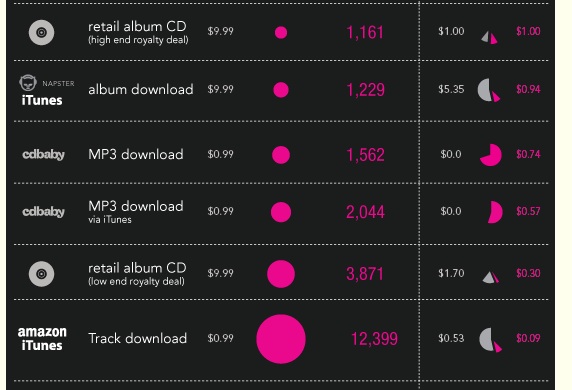
This graphic is a snapshot of a section of Ben Johncock’s ingenious and sobering visualisation of the sales in various formats a solo artist would need to achieve to earn the US minimum wage.
Ben’s point is that from the point of view of the artist the worst option of all is Spotify. But I was also struck by the asymmetry of the label vs. artist proportions (white vs purple numbers in right-hand column) on iTunes.
CORRECTION: Many thanks to all the readers who emailed to point out that the dazzling visualisation is the work of the incomparable David McCandless. The link to his graphic is here. The link was also at the bottom of Neb Johncock’s original post, but I missed it. Mea culpa, as we say in Ireland.

