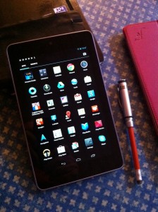
My Nexus 7 arrived yesterday. Here are first impressions:
Upsides
Yay! It does fit in a jacket pocket. In fact it’s easy to carry about unobtrusively.
Battery life: no rigorous test, but seems reasonable. At any rate it’s largely untouched (67% remaining) after a day’s text and browsing work (no multimedia). The Settings panel is very informative about battery use, showing which Apps are using most power.
Settings are easy and intuitive.
On-screen keyboard: Nice but seems erratically unresponsive at times. (Or else I haven’t figured out how to drive it.) Better layout than the default layout on iPad keyboard. Big plus: because of the physical size of the device and the portrait orientation I can type with two thumbs, like I used to do with my Psion 3 in the dim and distant past.
I tried it with Apple Bluetooth keyboard. Pairing was a bit fiddly. But once done, it worked just fine.
Nice screen.
Lighter than iPad. Easier to use as e-reader.
Great autocorrect when typing in Write app.
Very simple setup. Google ecosystem works well. Well, it ought to: if they can’t get that right, then they ought to quit.
Immediate auto-upgrade to Jelly Bean (where do they get these idiotic names?) You can also set Apps to auto-upgrade. Wonder if that’s also true of the OS. One of the bugbears with Android that drove me into the arms of IoS was the problem of upgrading from one Android version to another.)
Neat packaging and small charger.
Downsides
Portrait only – except for YouTube. I naively thought that this was controlled by software. But it seems to be baked in. This is very restrictive, especially for web pages. Unacceptably small print is the only way it can get everything in. I was completely wrong about this. Jeff Jarvis kindly explained (on Twitter) that there is a tiny icon in the Notifications panel which enables screen rotation to be toggled on or off. But there’s a cunning kicker: the home screen doesn’t auto-rotate; it’s only when one is running an app that rotation works.
Front-facing camera. Hopeless for photography. Not particularly impressive but adequate for Skype.
Twitter app not as good as the iPad version.
Only WiFi. No 3G. (Worked fine with iPhone as modem, though.)
Mixed
Apps ecosystem seems more chaotic than the IoS one. (This may be a reflection of my unfamiliarity with Android, not having used an Android device for 18 months.) Some apps, however, seem pretty good. Kindle for example. Ditto a note/journal writing tool called Write. Ditto Evernote. Nice integration between apps — eg between Write and Evernote. WordPress blogging app seems better than the IoS one. (Memo to self: check for upgrade on IoS).
Overall
Pretty good. Half the price of an iPad. Reasonable performance, good screen and some really good apps. And it fits nicely into your pocket.
Can’t figure out what the business model or marketing rationale is, though. I don’t think it’s really aimed at the iPad. So is it aimed at the Kindle Fire? (Since I haven’t tried the Fire I don’t have any basis for a comparison.) Most of the existing reviews seem to say: nice kit, pity about the content. But I’m not interest in ‘consuming content’: I want a device that I can use for the work that I do, which mainly involves thinking about, generating and editing ‘content’ (note-taking, newspaper columns, lecture drafts, outlines, photographs). At the moment, the iPad software ecosystem is proving brilliant for all of these uses — but it took time for the necessary apps to appear. The Nexus 7 is nowhere near as good for these purposes at the moment. But perhaps the necessary software will eventually arrive.
Other reviews
Charles Arthur — Guardian
Wired.co.uk
Tech Review
PC Advisor
Daily Telegraph
Arstechnica

