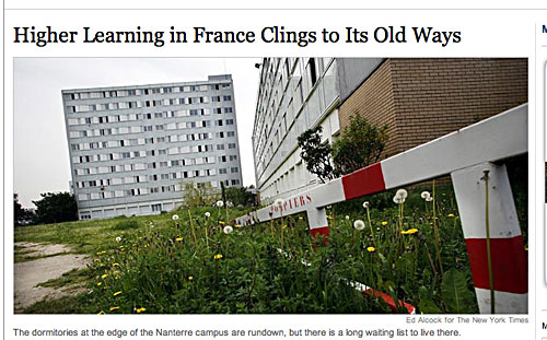
This is from the New York Times web site. It’s the illustration for an article explaining how dire the French (state-funded) university system is. The focus of the piece is the Nanterre campus of the University of Paris, which apparently has very little student accommodation, and what there is did not meet with the approval of the NYT reporter. What intrigued me, however, was the way the picture was used. You can see that the verticals haven’t been corrected, so the buildings lean at an angle that would make even the inhabitants of Pisa feel seasick.
This is a cheap tabloid trick. Bet it doesn’t stop the Times being as pompous as it usually is about journalistic standards, though.
